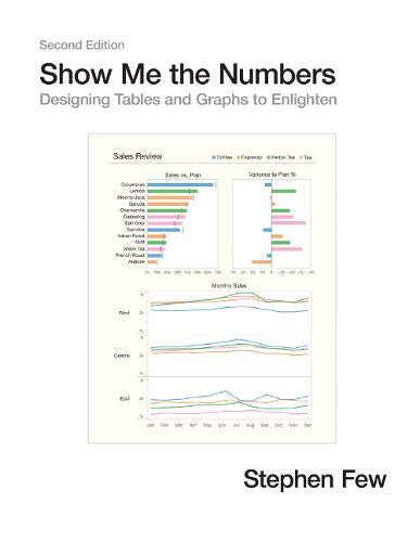
Most presentations of quantitative information are poorly designed—painfully so, often to the point of misinformation. This problem, however, is rarely noticed and even more rarely addressed. We use tables and graphs to communicate quantitative information: the critical numbers that measure the health, identify the opportunities, and forecast the future of our organizations. Even the best information is useless, however, if its story is poorly told. This problem exists because almost no one has ever been trained to design tables and graphs for effective and efficient communication. Show Me the Numbers: Designing Tables and Graphs to Enlighten is the most accessible, practical, and comprehensive guide to table and graph design available.
The second edition of Show Me the Numbers improves on the first by polishing the content throughout (including updated figures) and adding 91 more pages of content, including: 1) A new preface; 2) A new chapter entitled "Silly Graphs That Are Best Forsaken," which alerts readers to some of the current misuses of graphs such as donut charts, circle charts, unit charts, and funnel charts; 3) A new chapter about quantitative narrative entitled "Telling Compelling Stories with Numbers"; and 4) New appendices entitled "Constructing Table Lens Displays in Excel," "Constructing Box Plots in Excel," and "Useful Color Palettes."
Show Me the Numbers: Designing Tables and Graphs to Enlighten
📄 Viewing lite version
Full site ›
Book Details
Author(s)Few, Stephen
PublisherAnalytics Press
ISBN / ASIN0970601972
ISBN-139780970601971
AvailabilityIn Stock.
Sales Rank61,843
MarketplaceUnited States 🇺🇸
Description ▲
Similar Products ▼
- Information Dashboard Design: Displaying Data for At-a-Glance Monitoring
- Now You See It: Simple Visualization Techniques for Quantitative Analysis
- Storytelling with Data: A Data Visualization Guide for Business Professionals
- The Wall Street Journal Guide to Information Graphics: The Dos and Don'ts of Presenting Data, Facts, and Figures
- Good Charts: The HBR Guide to Making Smarter, More Persuasive Data Visualizations
- The Visual Display of Quantitative Information
- Storytelling with Data: Let's Practice!
- The Data Loom: Weaving Understanding by Thinking Critically and Scientifically with Data
- The Truthful Art: Data, Charts, and Maps for Communication
- Accounting for Non-Accountants: The Fast and Easy Way to Learn the Basics (Quick Start Your Business)